People in the UK are living longer than ever - a major achievement of modern science and healthcare. To help policy makers understand the implications of ageing, Foresight created interactive maps showing data at a local authority level.
Older people comprise a growing proportion of the population, making an increasing contribution to society, but their needs vary across the UK. Our maps are presented in four themes:
- Population and demographic change
- Health and wellbeing
- Housing and living arrangement
- Economy and skills
To create the interactive maps Foresight worked with the Office for National Statistics (ONS), who hold much of the relevant data.
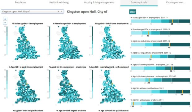
The maps provide a visual snapshot of how the ageing population varies across the country as a whole. The tool allows users to select individual local authorities and see how they compare with each other. For example how does population ageing differ between an inner city area and the middle of the countryside? Or from north and south?
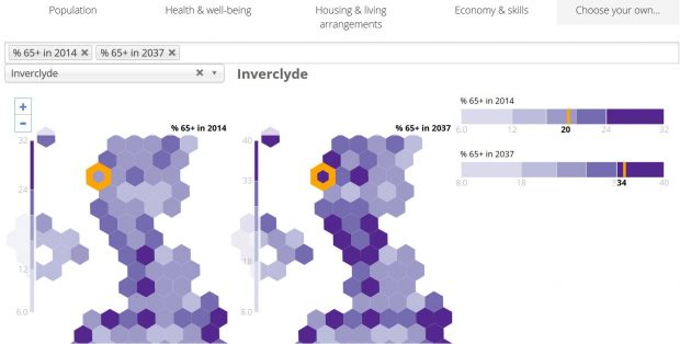
The user can also create unique comparisons of types of data from a long list in the ‘Choose your own’ tab. This allows you to compare the data sets that most interest you find out about ageing in your local area.
Key findings
One of the interesting ways to use the interactive map is to compare 2014 data with the ONS projections for 2037. The differences – for example in the percentage of people aged 65 and over– give a clear sense of where things will change in the future.
The maps also allow policy makers to understand the particular needs of different parts of the country. For example, places where older people are in poor health or have high levels of deprivation may face more acute challenges than places where they are not.
Ensuring that the UK is making the most of the opportunities afforded by an ageing population requires diverse responses at both local and national levels. These maps are designed to support policy makers at all levels. They are also for organisations like the Centre for Ageing Better who are continuing the project’s important work to understand the effects of the ageing population. The maps sit alongside the project’s final report, evidence cards (to be published) and evidence reviews to provide policy makers with the toolbox to help ensure the UK ages happily and successfully.
To keep up to date with Foresight Projects new findings, sign up for email updates.